I did some research and found some posters that I really feel like the style and layout of. I included some older iconic posters at the end that I feel could inspire me in this project.

The elements striking to me are the contrast between the detailed illustrations and the empty space in the poster which are separated diagonally. The play with text and visual elements convey the sense of lost gravity.
Edit from later date:
1. Concept: Falling upside down into space. Disorientation. Mirroring of emptiness and earth. Flipped text 2. Synthesis: Film poster of Gravity- showing two astronauts falling from earth. 3. Detailed half juxtaposed with empty space half. 4. Eye is first drawn to upper left corner then to the text, then to the empty space and the details in the bottom right corner.5 thin sans serif. 6. Image and text have a flipped aspect and similar lines. 7. The falling figure in the bottom right.

Colourful background contrast with the centred text and black and white figure.
Experimental typography as visual image

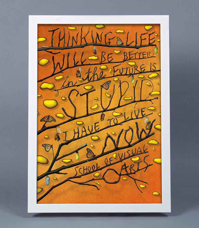
Beautiful illustration, lighting and mood in this poster capturing an important scene in this book.

Playful poster where typography is merged with the graphic of a spinning cd. The image fills the poster and conveys itself clearly.
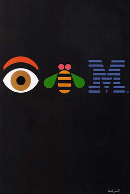
The main heading ‘type’ is created by graphic illustrations to communicate. Rebus puzzle device to draw interest. The rest of the poster is black emptiness to allow viewer to focus on interpreting the illustrations.

Swiss Style. Using a structured 3×7 grid in the composition. The balance of blocky modern Akzidenz-Grotesk (which helvetica originated from) and the soft and loose motion photograph of the dancer. The visual elements align to create an aesthetically pleasing balance.

Iconic poster. I feel like I have seen lots different versions of the poster- different colours and dimensions. Iconically art deco and sci fi vibe. The composition is very symmetrical.

Iconic poster. The type and image fit together in the swirly line quality. The playfulness of the line and graphics appropriately advertises the entertainment venue Le Chat Noir.

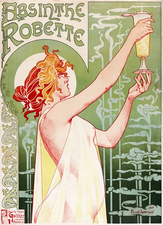
Art Nouveau posters advertising cigarettes and alcohol. The art nouveau style is intricate, sensuous and beautiful. The typography is part of the image.
Edit from later date:
1. Concept: Goddess like woman holding a cup of absinthe like a holy grail/ statue of liberty/ transcendent elixir ect.
2. Synthesis: Selling Absinthe Robette
3. Formal elements balanced? yes a balance of details
4. Hierarchy coherent? 1st drawn to head of figure then the absinthe then the text.
5 Type faces? Illustrative lettering- fancy and blocky.
6. Type + Image collaborate? The text mirrors the curve of head and halo and also the lines are swirly and art nouveau
7. What isn’t resolved? Nothing
2. Synthesis: Selling Absinthe Robette 3. Formal elements balanced? yes a balance of details 4. Hierarchy coherent? 1st drawn to head of figure then the absinthe then the text.5 Type faces? Illustrative lettering- fancy and blocky. 6. Type + Image collaborate? The text mirrors the curve of head and halo and also the lines are swirly and art nouveau 7. What isn’t resolved? Nothing
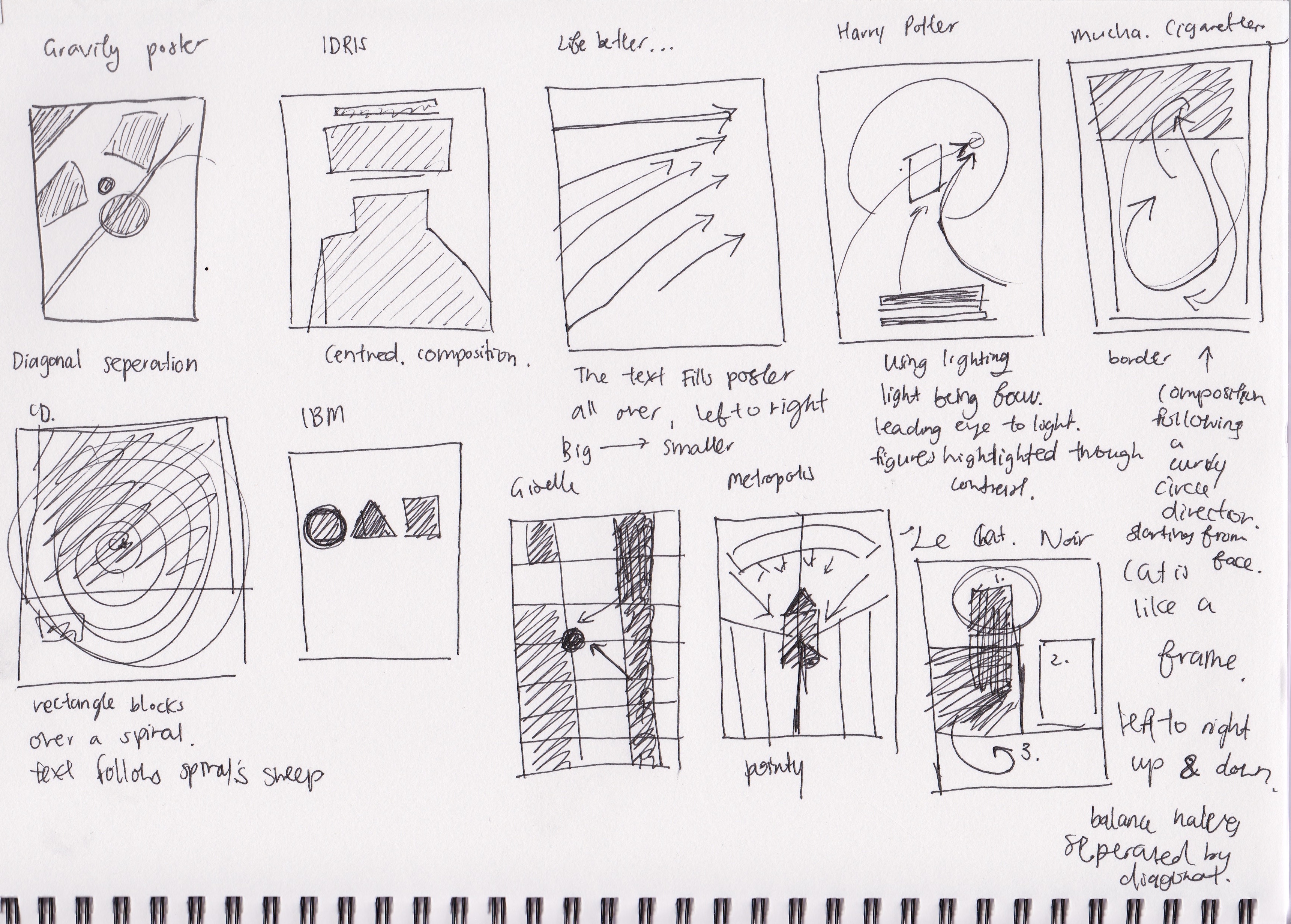
I made some thumbnails and notes to help me analyse the composition of these posters.