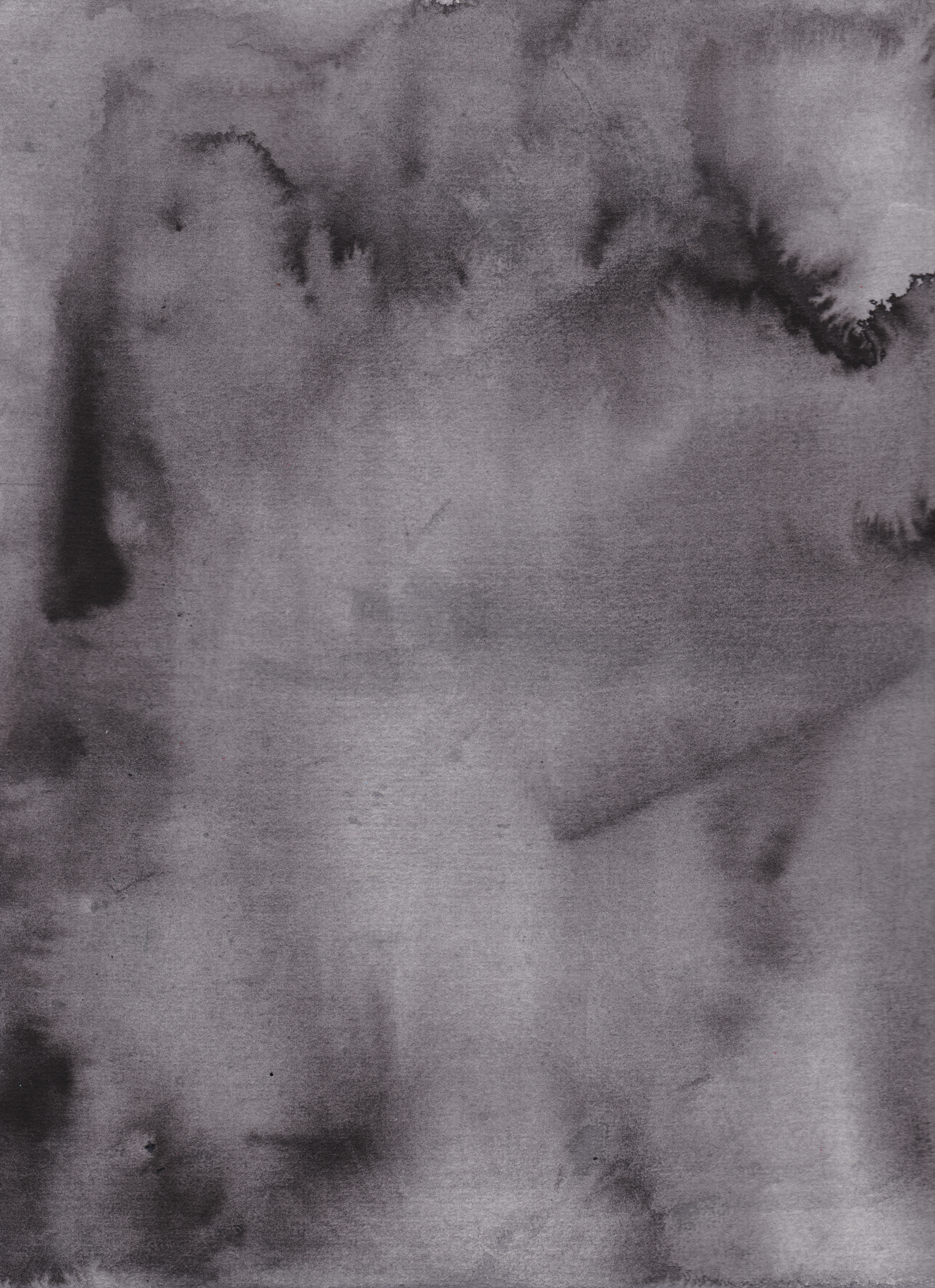
I appreciated the textures of the washes Quentin Blake used in his illustrations for Michael Rosen’s Sad Book. I feel like it evokes the mood and state of the narrator very well. In a pathetic fallacy kind of way, the setting and the weather echoing the grief and loss in the text. I wanted to incorporate watercolour washes in my publication, with the use of the textures the paint can make wet, like edges, blooms and shapes which I quite like.


Throughout the book, Quentin Blake lets the paint bleed into each other, using the textures to convey the wet stormy weather.
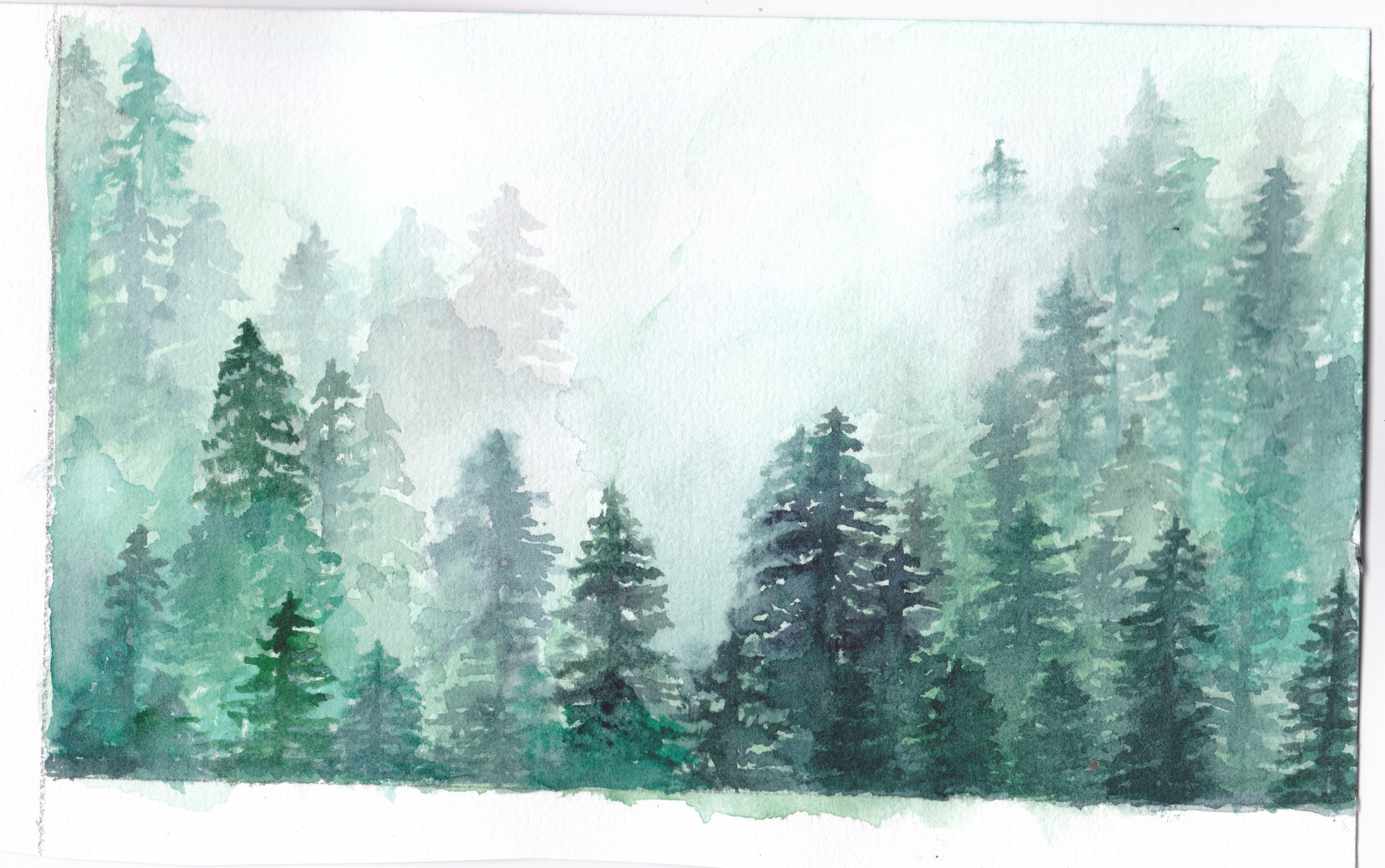


more suitable for dry sunny day?