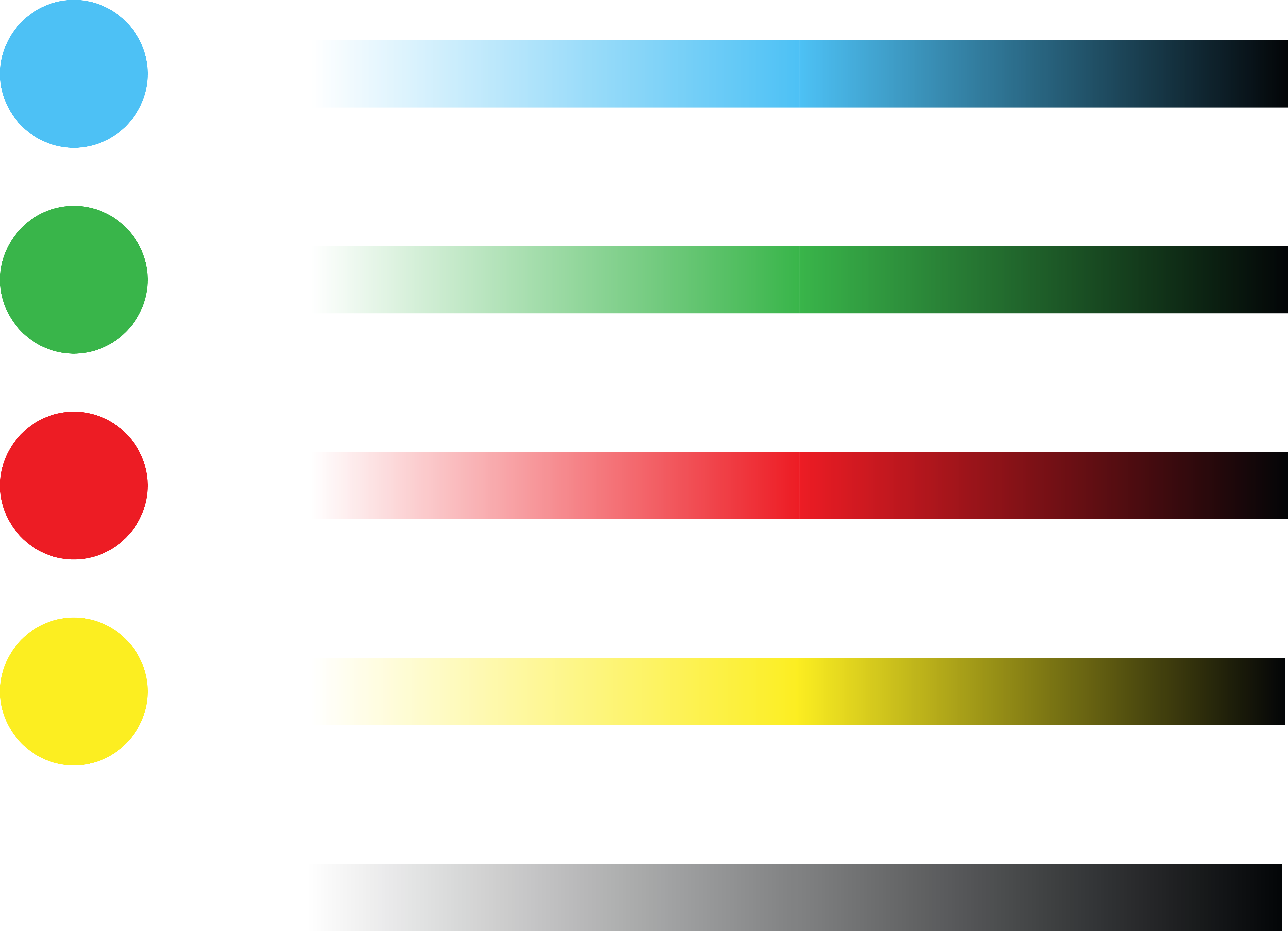
This was mostly decided already, but I decided to make a colour gradient swatch page thing to help guide me to use tints of my limited colour palette in different parts of my publication.
I was unsure about this spread for ages. I inverted my pen drawings of the philosophers because I wanted to go along with my solid colours for the interleaving ‘information’ spreads that contrast with the white of the ‘story’ parts. But I think I might scrap the whole solid colours for the interleaving spreads thing…maybe just keep it black and white? The solid colour backgrounds (black, red, yellow, blue, green is making the text look not so good…
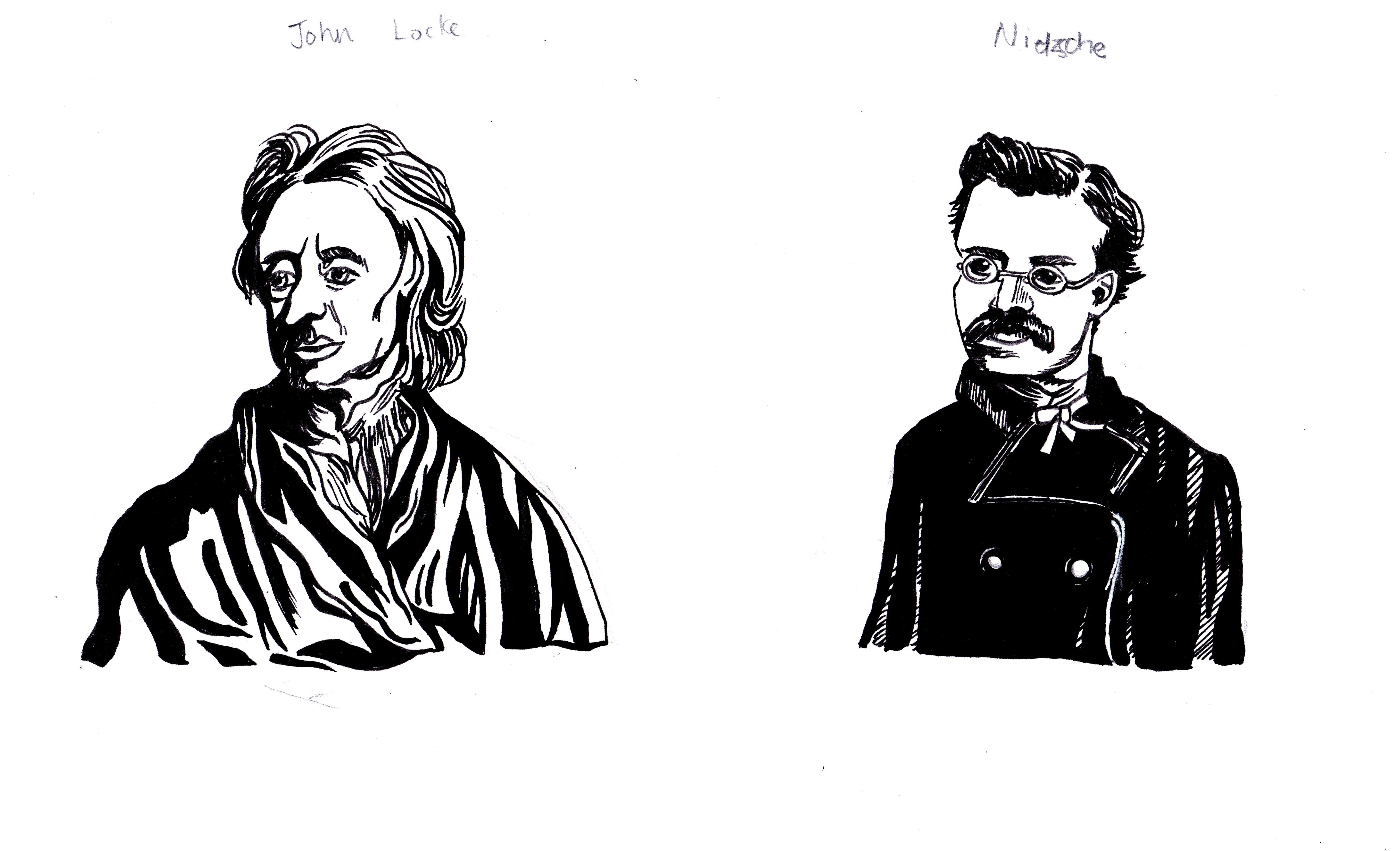


I got feedback and stuck with a white background and black pen drawings for the philosophers, screw the idea for the solid colour backgrounds of the limited palette colours idea for the interleaving spreads…
A illustration that I quite like after making a load of changes.


Decide to add another texture that can be repeated to indicate that the publication’s illustrations aren’t reproducing realistic reality but are more creative interpretations of the text content.
